You built a game in a weekend. You hand your phone to a friend. They squint, tap the wrong button, hand it back, and say “cool.” Something’s off. You can’t say what.
That’s what this guide is for.
We’ve played a lot of games built by developers without a design background, and they share the same problems: tiny text, no hierarchy, stats written as sentences, buttons that don’t respond. The hard part isn’t fixing them. It’s that if you’ve never designed anything, you can’t see them. Your game looks AI-made and you don’t know why.
By the end of this, you will.
A quick note before you dive in: the image examples below are only to illustrate a concept. Your app should have its own unique art, icons, fonts, etc.
1. Make text readable on a real phone
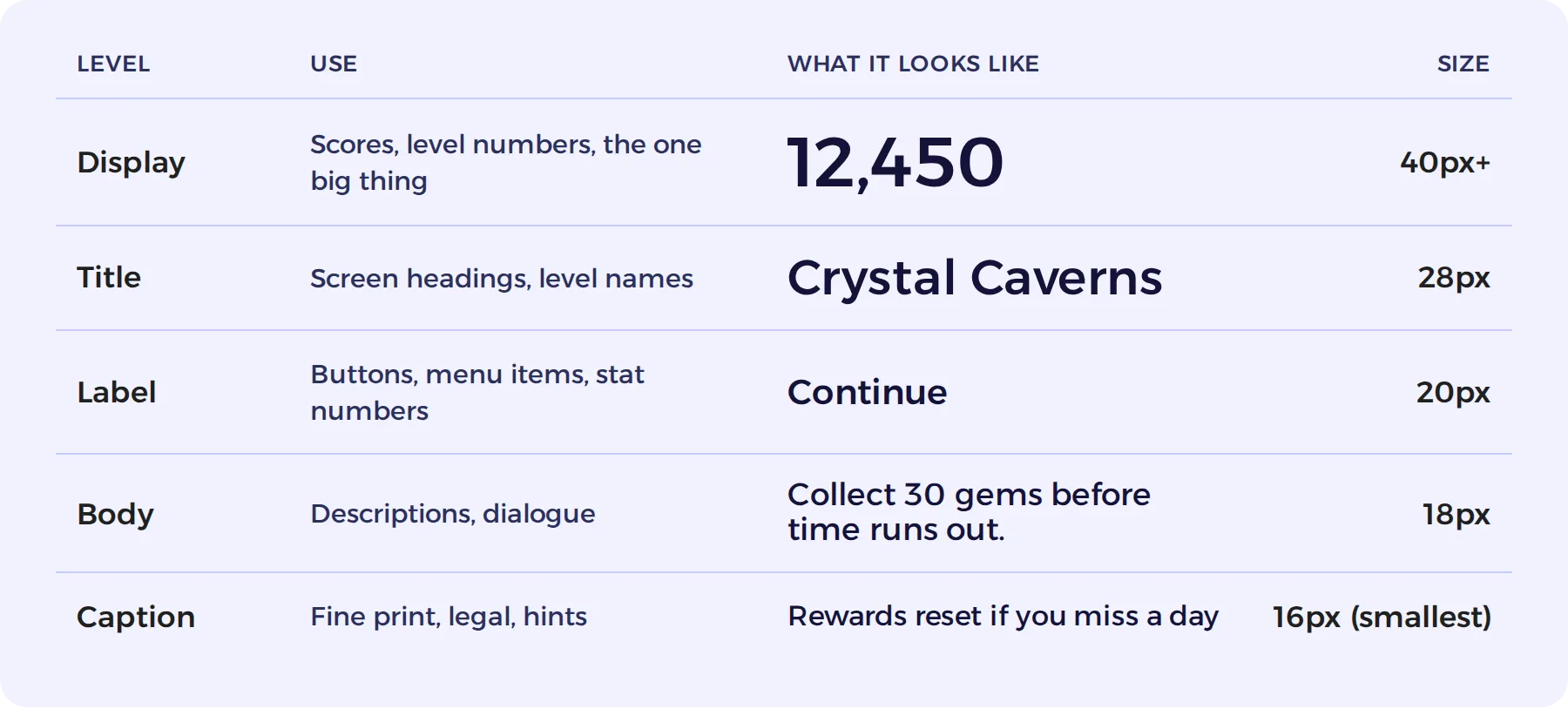
Treat 16px as the smallest you’ll go, and save that for disclaimers and fine print. Anything the player actually needs to read should be bigger.
Try picking five sizes and sticking to them. All text on every screen becomes one of these. A fixed scale is a big part of what makes screens feel like they belong to the same game.
- Contrast. Light text on dark, or dark text on light. Avoid gray on gray and light text over bright, busy art.
- Text over art needs a backing. A dark panel behind it, at 75–100% opacity when the art is busy. Text sitting directly on artwork, if not a heading, is quickly lost.
- Pick easily legible fonts. Skip thin, decorative, or handwritten fonts for anything the player actually has to read.
- Font choice: Changing your font from the generic text AI uses helps your app look less vibe coded. You can give your font file to AI to use in place of the generic. If you need fonts beyond what Claude uses automatically, check out Google Fonts.
- Consider your audience: People with varying vision will be playing your game. Consider color blind and bad eye sight players when you design. No one should need to squint to play.
2. Every screen has a visual hierarchy
When a player lands on a screen, their eye should know where to go without thinking. When everything is the same size and weight, nothing stands out and the screen reads as noise.
Three levels:
- Primary. The one thing to look at or tap. Biggest, boldest, brightest.
- Secondary. Supporting info. Medium size, normal weight.
- Tertiary. Details and hints. Small, muted color.
You create hierarchy with size, weight (how bold), color, and position. The hero content (heading, score, character) should be the most attention-grabbing thing on the screen.
3. Show it rather than explain it
This is one of the biggest AI pitfalls. AI loves to explain things in sentences. Players mostly don’t read sentences; they glance.
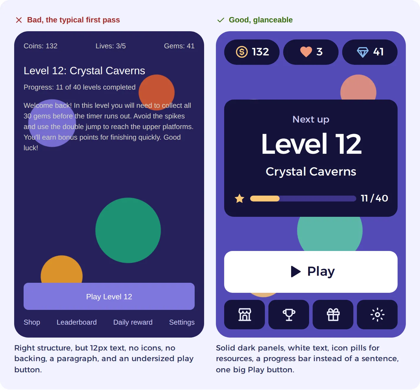
- Give each stat its own box with its own icon. Coins, gems, time, lives, score: an icon + a number in a small card works far better than “You earned 85 coins and collected 30 gems.”
- The standard layout is icon on the left, number on the right, vertically centered with each other. Not a hard rule, but it’s what players expect.
- Make the icon at least as tall as the text, ideally taller. A 16px icon next to 18px text looks like an afterthought. 24–32px feels right.
- Give icons some weight. Filled or medium-stroke icons hold up on a mobile game screen. Hairline outlines vanish.
- Similar stats get similar boxes. Currencies, for example, should all be the same size. Not everything has to match, but the icon and number should dominate their box. AI loves to leave lots of empty space.
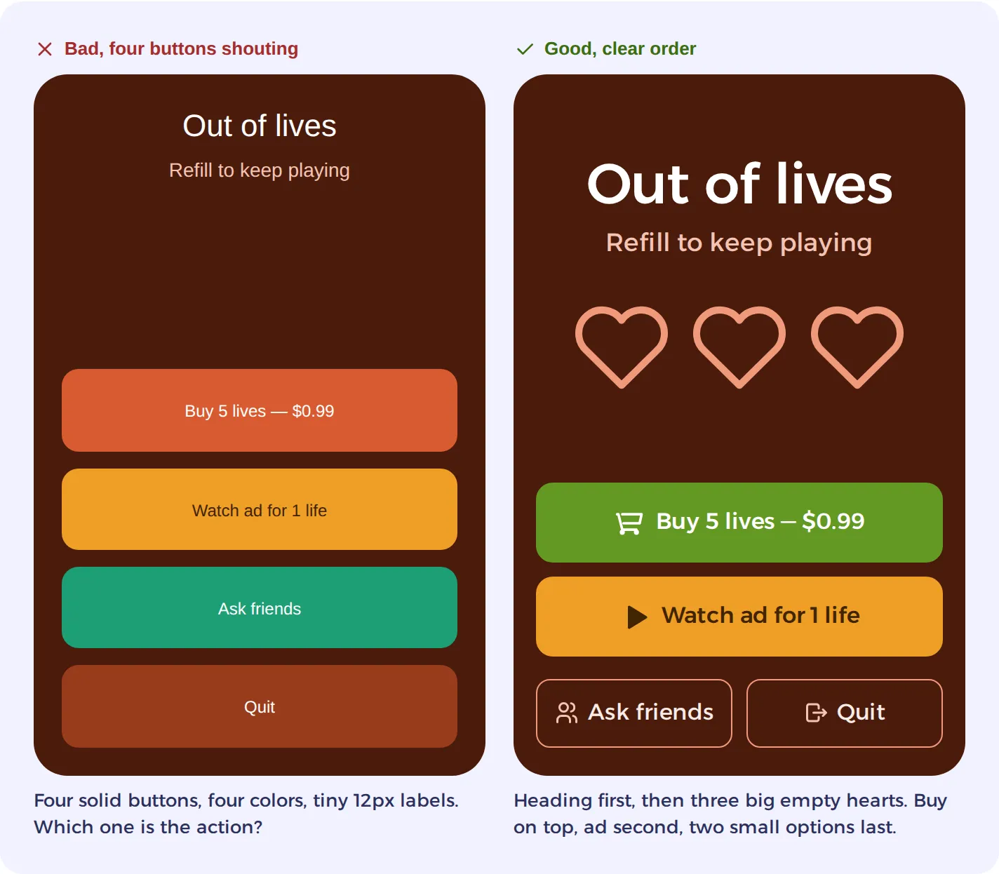
- Show state with the icon itself. Three empty hearts says “out of lives” at a glance. Grayed-out stars say “not earned yet.”
- Stars, bars, and badges beat numbers. “3 of 3 stars” is three filled stars. “Progress: 60%” is a bar. “New high score” is a badge. A number or text can sit alongside any of these; the visual just carries the meaning first.
- If every screen is a wall of text, something’s wrong. An occasional descriptive screen is fine. A habit of them isn’t.
- Tutorials: demo it, then let them do it. Show the move, then hand over control. Text on its own is the weakest way to teach.
4. Buttons
AI loves to make generic containers and buttons that look primitive.
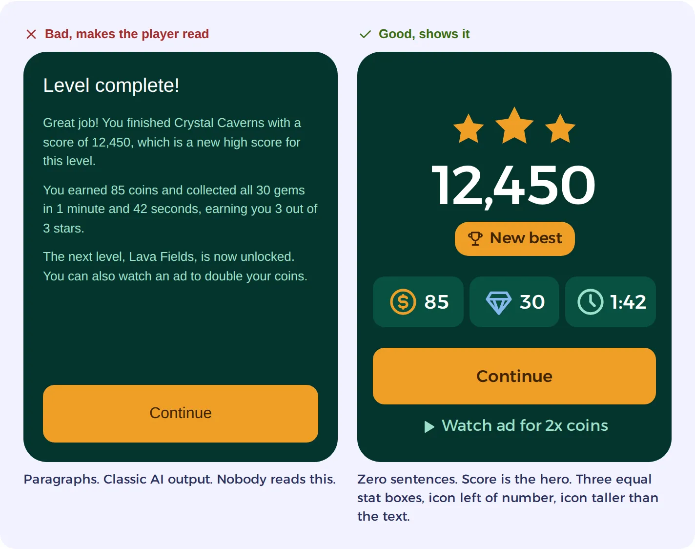
- Aim for one primary button per screen. The main action gets the big, solid, bright button. If it’s the only light thing on a dark screen, even better.
- If there’s a money button, it goes on top. The free alternative (watch ad) goes second.
- Keep secondary actions small and side by side. Ask friends, Quit, Back, Skip: two outlined half-width buttons in one row at the bottom reads much better than four full-width solid buttons stacked up.
- Icons on buttons help. Not required, but a cart on Buy or a play triangle on Watch ad is understood faster than the words alone.
- Every button reacts when tapped. It darkens, shrinks slightly, or flashes for a fraction of a second. A button that doesn’t respond feels broken, and players tap it again. This is the most skipped detail in AI-built games.
- A gray button reads as disabled. If it’s tappable, give it a color or an outline.
- Let disabled buttons look disabled. Faded, no shadow, no bright color. If the player can’t do it yet, the button shouldn’t suggest they can.
- Make buttons look tappable. Filled shape or clear outline, obvious edges, 16px+ label. A 12px label in a big button looks broken or like it was hastily made.
- Tooltips: Tap an icon (say, the HP counter) and a small popup explains what it means. Tap anywhere else and it goes away. Not a must-have, but players appreciate it.
5. The home screen doesn’t scroll
AI loves to scroll. It will more than likely treat a game like a website on the first draft.
Ideally, everything a player needs on the home screen fits without scrolling: resources, where they are, the Play button, and the nav. If it doesn’t fit, cutting something or moving it to a sub-screen works better than shrinking everything down.
The same goes for decision screens (out of lives, level complete, a paywall). The player should be able to see every option at once.
This does not mean every page cannot scroll, but the homepage and important info should be easily seen at once.
6. Tap targets: fingers are bigger than cursors
- Aim for tap targets of at least 44 × 44px. That’s the common mobile standard. Go bigger for anything used mid-gameplay.
- Leave space between tappable things. 8–12px at least, or players start hitting the wrong one.
- Design for the thumb. Holding a phone one-handed, the bottom half of the screen is easy to reach, the middle is fine, and the top corners take a stretch. The primary button and anything tapped repeatedly belong in the lower half. Things you’d rather not have tapped by accident (Quit, Settings) are happier up top.
7. Spacing, alignment, and edges
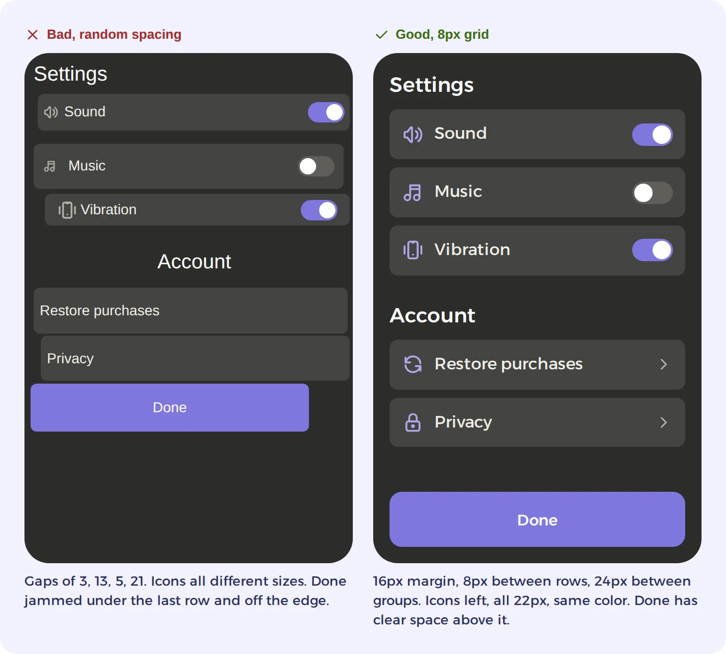
- Pick one spacing unit and stick to it. 8px is a good base: gaps become 8, 16, 24, 32 instead of whatever 13 or 21 happened to land.
- Keep buttons clear of important text and other buttons. And watch for overlap’s cousin, cramming: when elements are packed edge to edge the screen feels cluttered even if nothing technically touches. Cutting something usually beats squeezing everything.
- Align things. Left edges line up. Text in list rows starts in one column.
- Keep things off the edge of the screen. A consistent margin on all four sides, 16px at least, and more (24px+) at the top and bottom since screen shapes and browser chrome vary. Anything tappable is safest well inside that margin.
- Give things room. Padding inside cards and buttons so the content isn’t kissing the border. But not so much that it looks like text isn’t prominent in the button.
- Group related things close together, and put space between groups. 8px between rows in a group, 24px between groups. Space is how you show what belongs with what.
- Use real controls. A toggle switch instead of the word “On.” A chevron on rows that open something. Players already know these shapes, so they don’t have to read them.
- Give list rows an icon. Same size (22–24px), same color, on the left. A settings list with no icons reads as a wall of words.
8. Continuity
Players learn your game’s layout once. Every time you break the pattern, they have to learn it again.
- Same action, same look. If Continue is an amber button on one screen, keep it amber on every screen. Blue here and green there makes players double-check.
- Same position. Back lives in one corner. Close lives in one corner. The primary button sits in the same spot at the bottom.
- Same words. Pick one: Play or Start. Continue or Next. Coins or Gold. Mixing them is a small tax on every screen.
- Same icons. One coin icon, one heart icon, one gem icon, used everywhere they appear.
- Same spacing and corner radius. If cards have 12px corners, all cards have 12px corners.
9. Motion with a purpose
Animation works best when it explains what just happened. If it isn’t doing that, it’s probably worth cutting.
- Keep it short. UI transitions run about 150–300ms. Anything longer feels sluggish on the tenth time through. Celebration moments (level complete, big win) can run longer because they’re the point.
- Come from somewhere, go somewhere. A popup grows from the button that opened it. A collected coin flies to the coin counter. Things that just appear and vanish feel disconnected.
- Ease in and out. Nothing in the real world moves at a constant speed. Linear motion looks robotic.
- Go easy on how much animates. If every button bounces, every panel slides, and every number counts up, nothing stands out. Saving motion for the primary action and for rewards makes both land harder.
- Try not to make the player wait for it. If they tap during an animation, respond right away and let them skip.
10. Color: less is more
- One accent color for the primary action and important highlights. Use it sparingly so it stands out.
- A neutral base (dark panels, or light ones) for everything else.
- Dark panels on a bright world. If your background art is bright and busy, try putting your UI inside a solid dark panel. You keep the energy of the art and the text stays readable.
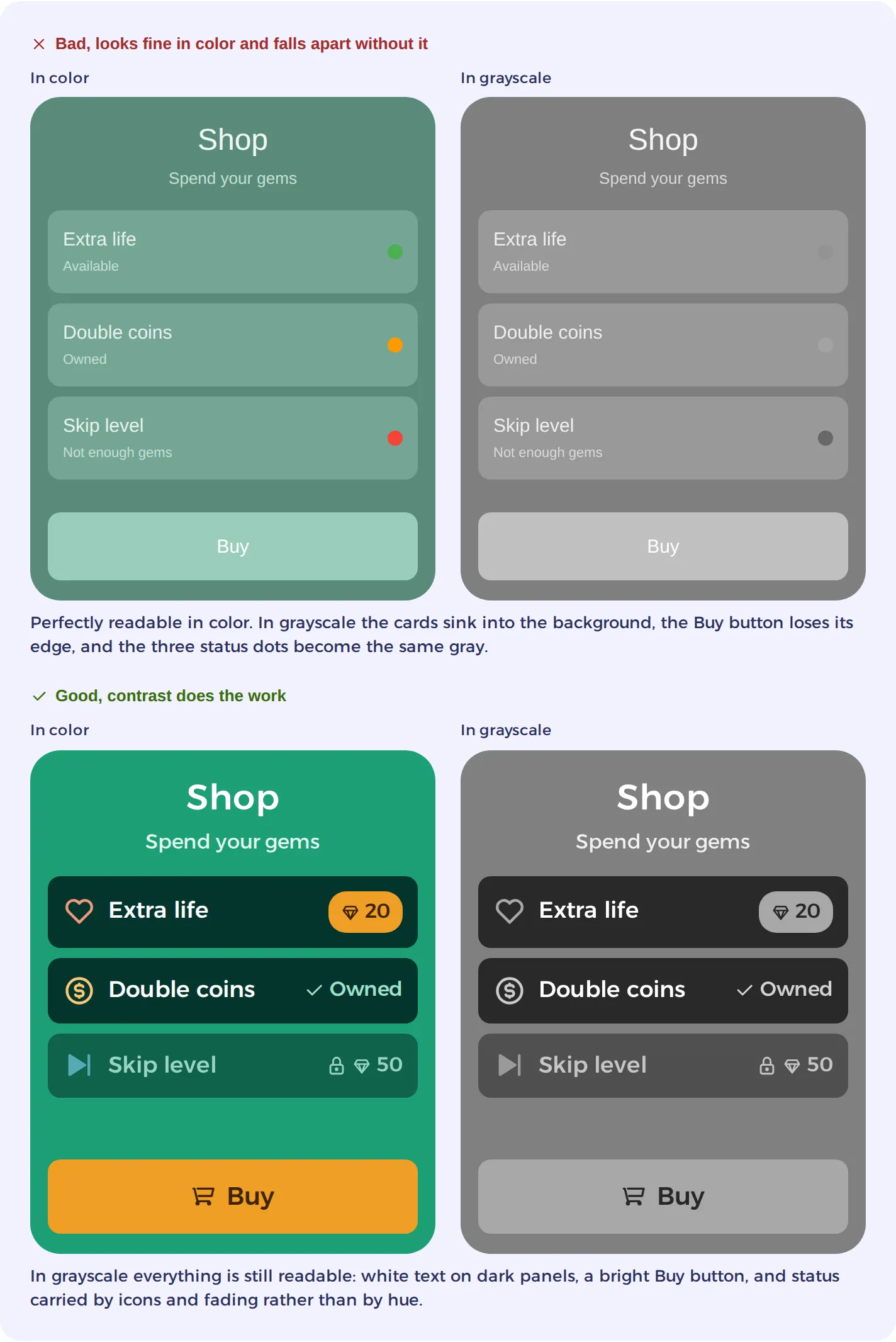
- Try not to rely on color alone to mean something. An icon alongside covers the players who are colorblind.
- Check contrast. 4.5:1 between text and its background is the usual target. Any free contrast checker tells you in two seconds.
- Picking a color palette: AI loves to choose very bland color palettes. Check out websites like Coolors.co which let you generate cohesive color palettes if you need some inspiration.
Two quick contrast checks. The squint test: blur your eyes at the screen. Text and buttons that disappear into their backgrounds don’t have enough contrast. The grayscale test: screenshot the screen and turn it grayscale. If elements blend together, color was doing all the work and the contrast isn’t really there.
Think you are done? Play it yourself. On a real phone.
This is the one that catches everything else. Before shipping, we’d strongly suggest:
- Load it on an actual phone rather than a simulator on a monitor.
- Hold it at normal distance and read every piece of text. If you have to squint, it’s too small.
- Tap every button with your thumb. If you miss or hit the wrong one, fix it. Often times, the first draft will have many broken buttons.
- Hand it to someone who’s never seen it and watch what they tap first, without explaining anything. Wherever they hesitate is the thing to fix.